Pickleball Rhode Island
Brand Identity, Strategy, Digital Design, Print Design, Product Design, Copy
A simple and engaging brand identity pitch for the premier place to learn and play pickleball in the Ocean State.

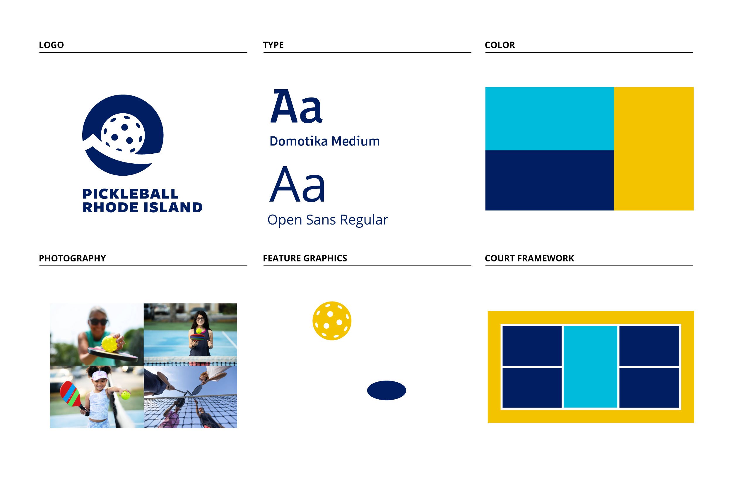
Pickleball Rhode Island's logo features a pickleball and wave icon inspired by Rhode Island's "Ocean State" nickname. It is accompanied by a sans serif wordmark set in Freight Sans Black. The logo can be applied in one of four different formats to suit the need of a particular application.

The visual language for Pickleball Rhode Island relies on two elements, a court-inspired graphic framework and a feature graphic that includes a ball and its shadow. Based on a technical drawing of a pickleball court, the framework is always cropped when applied, and it brings together logo, type, and photography to communicate memorably. The feature graphic is used flexibly to add emphasis and depth to each layout.


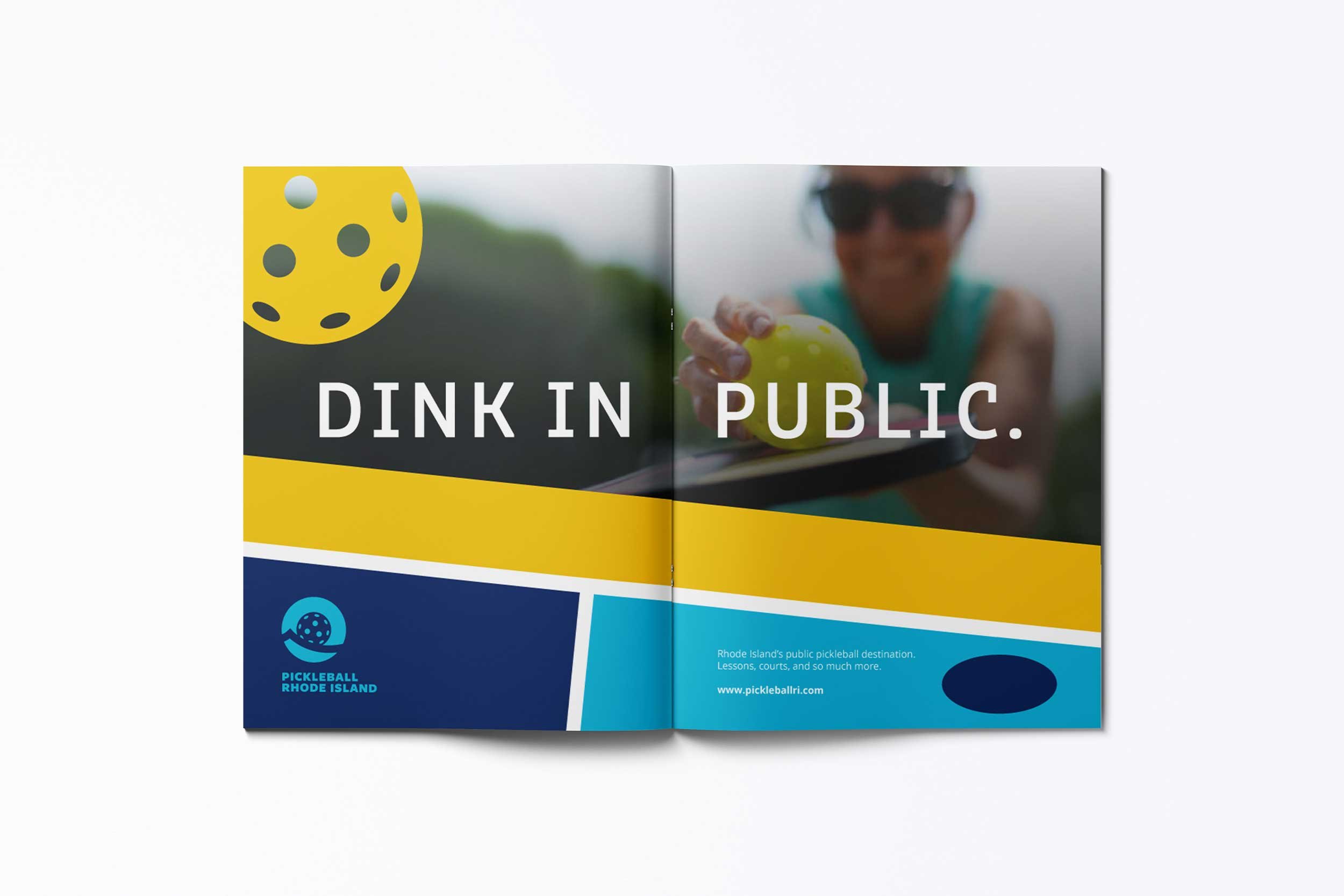
Getting the new brand in front of consumers is critical to the marketing strategy. The system extends easily to outdoor and publication advertising.

Instagram and Facebook are key channels for customer acquisition and communication. The system handles the visual challenges associated with these platforms.

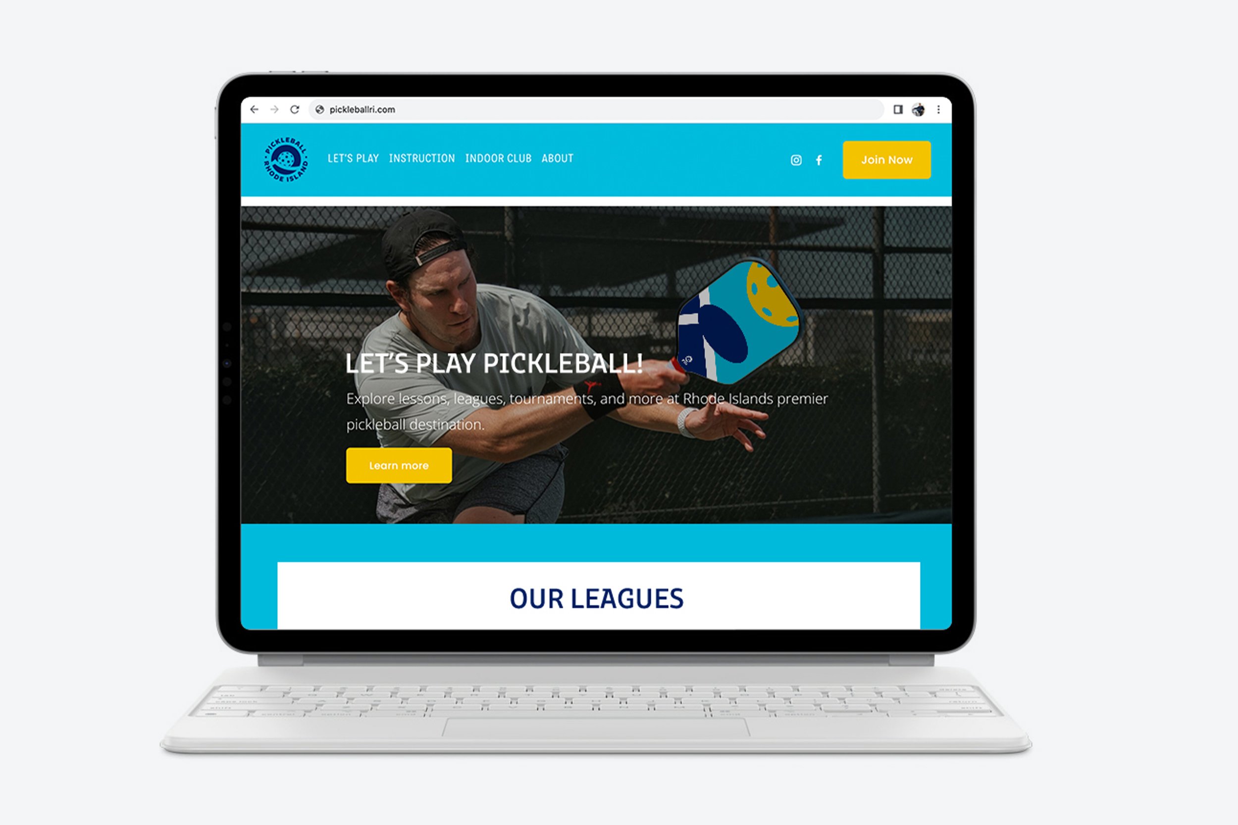
The bright color palette and simple graphics employed to create a Squarespace website.


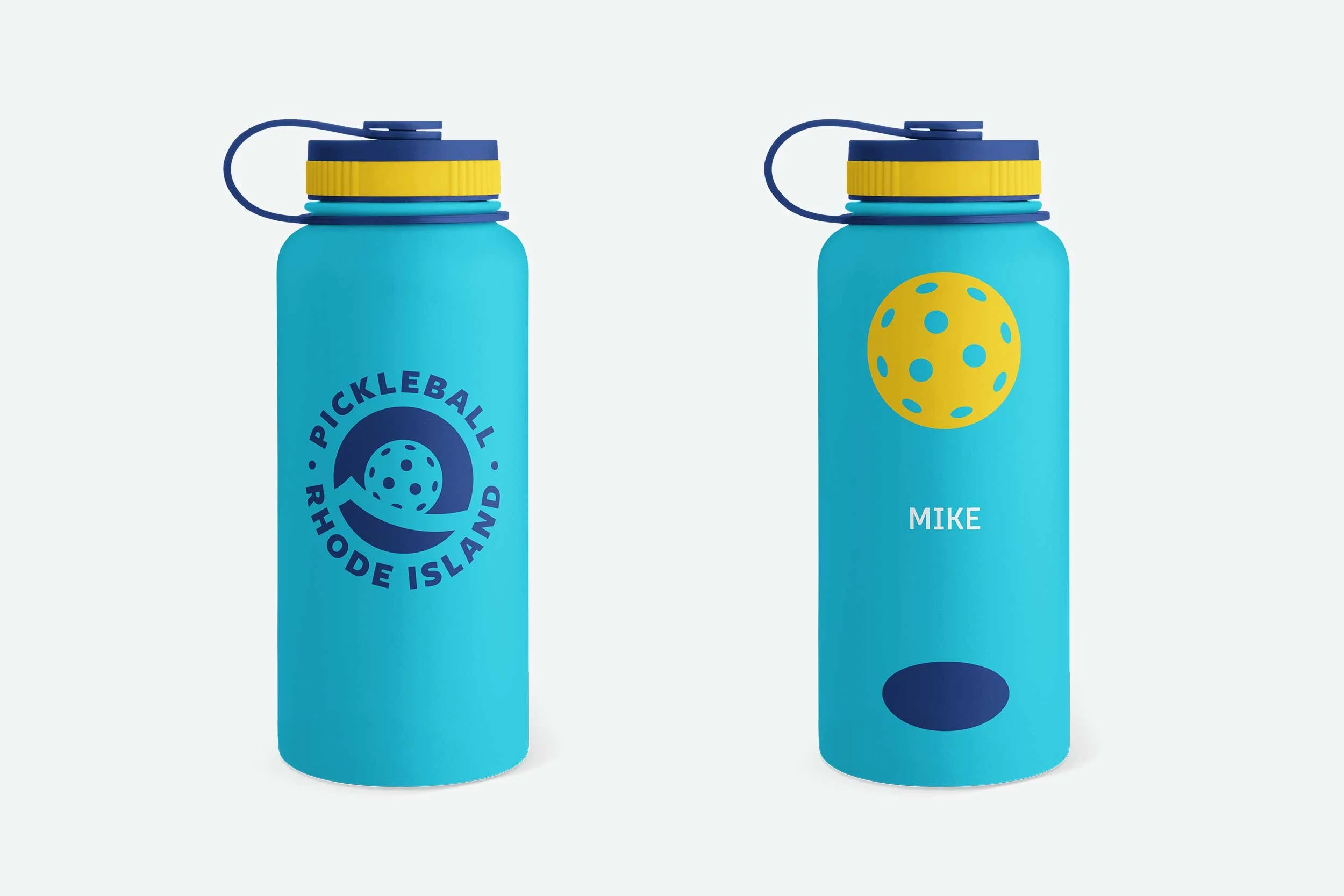
The brand identity performs well across physical products and environments.
